
What can I make easier?
A better-looking screen is not automatically a better experience. The work happens before Figma opens.

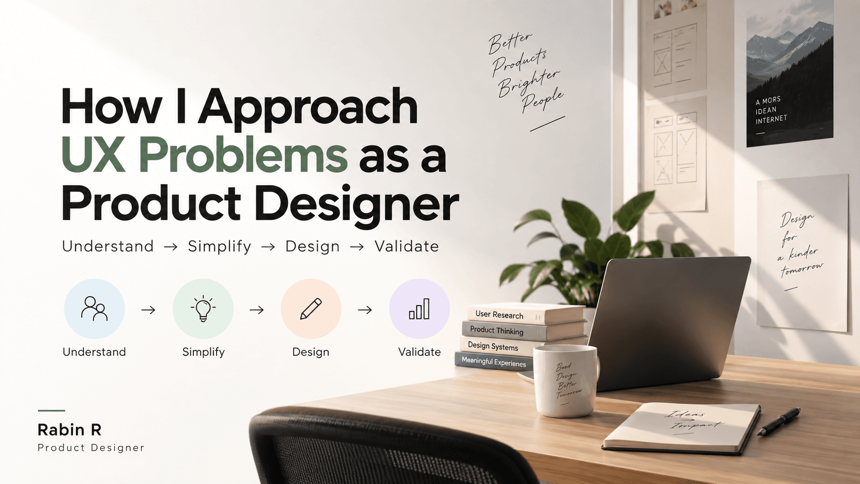
When I come across a frustrating product experience, my first instinct is not to redesign the screen. I ask why it is difficult for the user, because often the problem is not the UI at all — it is an unnecessary step, unclear information, too many choices, poor hierarchy, or an interface that asks someone to think when it could have decided for them. That one question, “what can I make easier?”, shapes how I work through every UX problem.
1. Define the problem before opening Figma
It is tempting to jump straight to solutions, but a better-looking screen does not automatically create a better experience. Take a user searching for a 2BHK on a real-estate platform: hundreds of listings, several filters, near-identical property cards, pricing shown differently in each one, and three ways to contact an owner. That looks like a search or a UI problem. The deeper question is how we help someone confidently narrow down the right property — and that changes what gets designed. Instead of redrawing the listing screen, I start with what information a person actually needs in order to decide.
2. Look at it like a first-time user
When you work closely with a product, everything eventually feels obvious. To a new user it is not. A first-time cab booking raises small questions: is this my exact pickup point, is this the final fare, can I change the destination, when does the driver arrive. Each unanswered one adds uncertainty. So when I review an experience I look for the moments where someone has to stop and think. If an interface keeps prompting “what do I do next?”, there is an opportunity sitting right there.
3. Map the journey, then find the friction
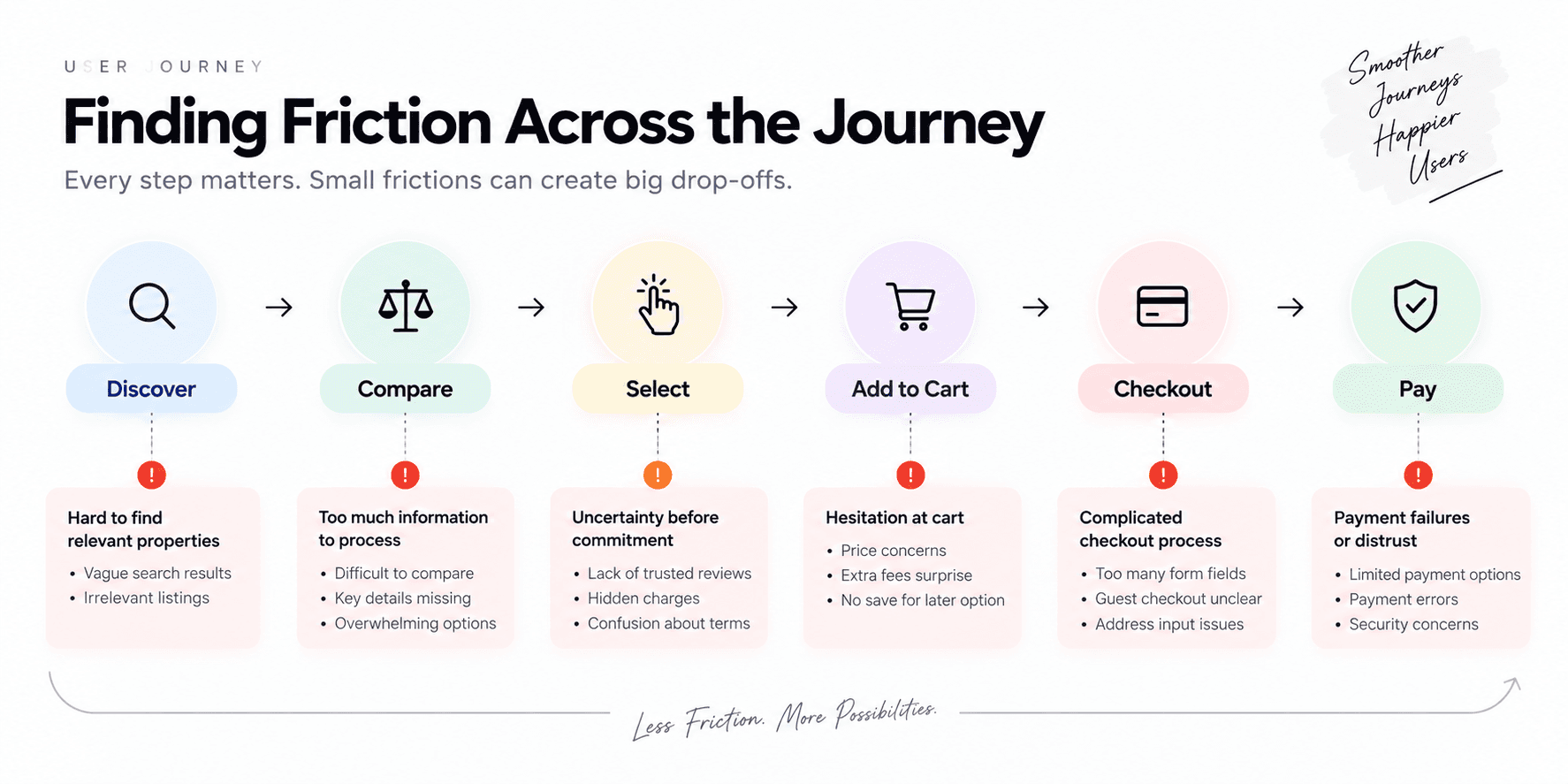
I prefer to look at the whole journey rather than treat each screen as an isolated design problem. For an e-commerce product that is roughly discover → compare → select → add to cart → checkout → pay, and the interesting part is the transitions. Does the product page carry enough to decide on? Are delivery charges communicated early enough, or as a surprise at the end? Does checkout ask for anything it does not need yet? Is the primary action obvious? One small issue rarely ruins an experience. Several across a journey do.
4. Simplify before adding
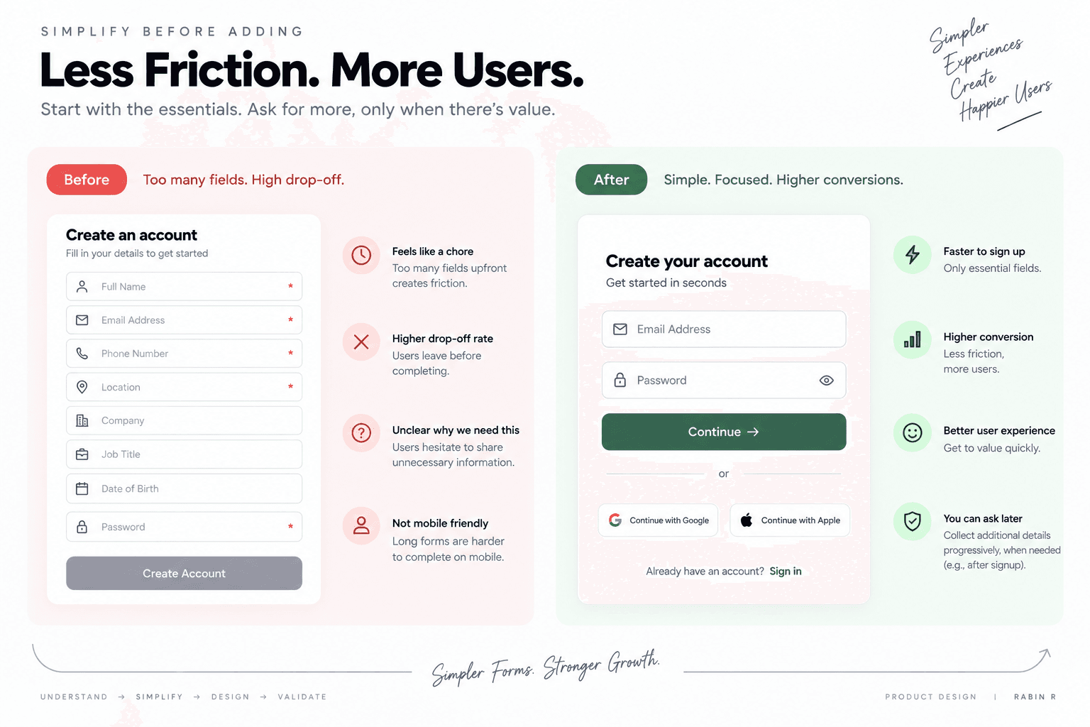
I try to avoid solving every UX problem by adding another feature. Sometimes removing something is the better answer. A signup form asking for name, email, phone, location, company, job title, date of birth and password, when the user’s immediate goal is simply to have an account, is asking eight questions to answer one. Email, password, continue is usually enough for now; the rest can be requested later, when there is a visible reason for it. Every additional field is another decision, and every unnecessary decision is friction. So before “what should we add?”, I ask what we can remove.
5. Use familiar patterns — but know why they work
I study competitors and established patterns, though not to copy screens. I want to understand why a pattern works. A heart beside a product already means save or wishlist to almost everyone. Replacing it with something new might make the interface more distinctive, but it also hands the user something to learn. Good UX does not always need to be innovative; sometimes familiarity is the feature. The judgement is knowing what people already expect, and when there is a genuine reason to break from it.
6. Explore more than one solution
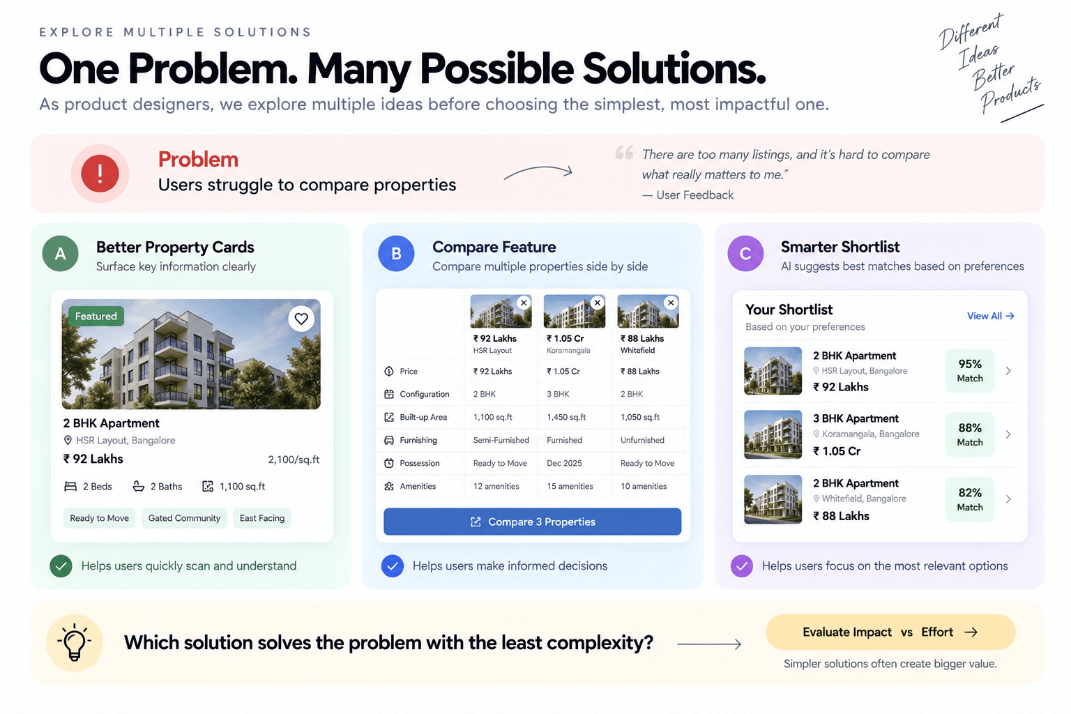
My first idea is still an assumption, so I try not to get attached to it. If users are struggling to compare properties, the options might be: improve the information hierarchy of the cards, add a dedicated comparison feature, or improve shortlisting so details can be reviewed later. All three can look good in Figma, which is exactly why that is not the deciding factor. The question is which one addresses the actual problem with the least unnecessary complexity. That turns the review from “I like this version” into “this works better because”, and the second conversation is the one worth having.
7. Validate, learn, iterate
A polished prototype can still rest on the wrong assumption. Suppose we believe users cannot find relevant properties, so we improve the filters. Research might show that people find properties fine — they just do not trust what the listings say. Better filters will not touch that. Depending on the project, validation is user conversations, usability testing, feedback, analytics or a live experiment. The process is not design → make it beautiful → done. It is closer to understand → explore → design → validate → learn → iterate.
The part I keep coming back to
The longer I do this, the more product design looks like a series of decisions rather than a series of screens. What information appears first. What can be removed. Where someone is likely to hesitate. What a user needs before they can commit. How to resolve that while still serving what the product needs. When I open Figma, I do not want to start by asking what I can design. I want to start by asking what I can make easier.